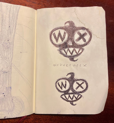
2023 has been a big year for Weaverwerx; a resurrection of sorts after years of little to no activity. I have taken a workspace in the old Kino Studios in Riga, Latvia and have begun to pursue comix, drawings and film projects again. As part of this new era, I have revamped the Weaverwerx website, which was the perfect opportunity design a new logo. Now embarking on a new logo design may seem like a simple process, but even the "richest" and "smartest" person in the world can fuck it up, resulting in losing years of positive branding, good will and billions of dollars. Luckily I don't have those kinds of pressures on me. I'm just this guy trying to carve out my own tiny niche in the real and virtual world. The only person I need to please is myself, but that is easier said than done. I'm a fickle, difficult to please customer when it comes to my own work and have a special mutant power for overthinking that would give Professor X a headache. Somehow I managed to find my way, creating and discarding a dozen different concepts before landing on one that feels right, so right in fact that it will likely (always leave yourself an out) be the LAST WEAVERWERX LOGO. So, without further ado, let me introduce you to the new look.
Tuesday, November 07, 2023
The Last Logo
Yes, it is a critter, animal, creature of some type and needs a nickname, which I am puzzling out. Any suggestions? I think of artistic ideas as being like creatures roaming around looking for a worthy person to be their portal into our world. These ideas animals can be enormously powerful and lucrative and creative people bring them forth with nothing more than a pencil and blank sheet of paper. This critter here is hungry and lustful and curious. It wants your attention. I wanted this logo to be part watchdog, part chupacabra, part feral cat, and part alien from another world. I want it to guard my back, but also push me when I need it, like everyday. From a design point-of-view, I wanted an image that would stay in folks' minds and not be confused with another thing; not too complex, but not too simple. Maybe even something that will provoke some affection. I also think it'll look damn fine on a t-shirt!
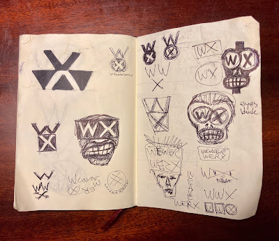
Time to show how the sausage was made. Here are my raw, rough brainstorming sketches as I worked through various possibilities, including some boring, too generic non-character options.
Some of those "shrunken head" and Tiki God-ish designs could wind up making cameo appearances in some future comix stories, so keep your eyes peeled.
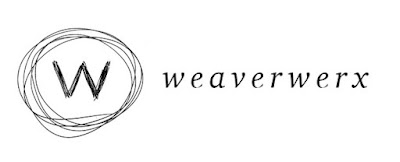
The previous Weaverwerx logo was a simple hand-drawn W with scribbly circle around it, which I call the "Hairball Logo". I'm ditching it because it is too generic. It could be used for a hair salon or a bar or sock company, whatever. I like the hand-drawn quality, but that's about it. I only used this one for a couple of years, so it was really just a placeholder.
Before that one, I had been using this dapper chap with the square head and formal suit. This design originated in the late 1990s and was fun, but it looked too much of it's time. I do like the "round peg in the square hole" head and the "W" suit collar. It was also a load of fun to animate, but times have changed, so time to say adieu.
Keep smiling,
OK HW
Subscribe to:
Comments (Atom)


